You know that you can maximize your profits by optimizing the layout of your grocery store. But do you know the psychology behind an effective layout? Learn the basic organizational principles that will keep your customers shopping and improve your supermarket’s overall sales.
Design Your Supermarket With the Consumer in Mind

The following tips outline important design considerations for each section of your grocery store:
- The Vestibule
Customers should be welcomed to your store not only with a great physical sensation, but also with inviting smells and pleasing sights. Soothing warmth in the winter and refreshing cool air in the summer will prime your customers for a pleasant shopping experience, entice them to stay longer and presumably purchase more of your inventory. - The Sights and Smells of the Decompression Zone
The “decompression zone” is the first retail space your customers will encounter. This is where you want to create a sensory experience that will make them feel good about your store and send hunger signals to the brain. Locate your bakery and coffee shop close to the decompression zone to add more enticing aromas and to get customers feeling good and thinking about food. Customers should also be greeted with a display area full of fresh cut flowers, lush potted plants and colorful gift balloons. The colorful display and delightful floral fragrances will make them feel welcome. - Freshness in the Produce Area
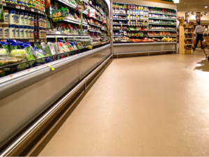
As customers are strolling through the decompression zone, they should be able to see the fresh produce section. Here, customers should find fully stocked shelves brimming with colorful fruits and vegetables. Their first impression of fresh inventory is reinforced here. - Far-Flung Staples
Ask anyone who does the family shopping what they “run to the store” for most often, and the answer will likely include milk, eggs and butter. Locate the dairy section as far away as possible from the entrance, giving your shoppers time to discover additional items they may not have intended on buying. - Keep Strategically Stocked Groceries Central
You should devote the central part of your supermarket floor plan to general groceries—canned and boxed goods, bottled beverages and cleaning and pet supplies. Place gourmet, local and small brands on the top shelves. Middle shelves should be reserved for best sellers, and you should place generic brands, store brands and bulk items on the bottom shelf.
McCue Enhances Any Grocery Store Layout

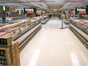
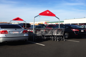
The best grocery store layout plans need to incorporate retail damage prevention. McCue offers a wide variety of bumpers and corner guards to keep your shelving and refrigerator cases looking like new. Protect your customers’ cars and your shopping carts with McCue’s selection of cart corrals that come in a variety of shapes and sizes that can fit any store or parking lot.
Request a catalog to see our entire line of innovative products designed to enhance any grocery store layout.
———-
Sources:
Good Living Warehouse: http://www.goodlivingwarehouse.com/grocery-store-layouts-the-psychology-of-profit
Real Simple: http://www.realsimple.com/food-recipes/shopping-storing/more-shopping-storing/grocery-store-layout/flowers
Notre Dame College: http://online.notredamecollege.edu/psychology/the-psychology-behind-a-grocery-store-layout


